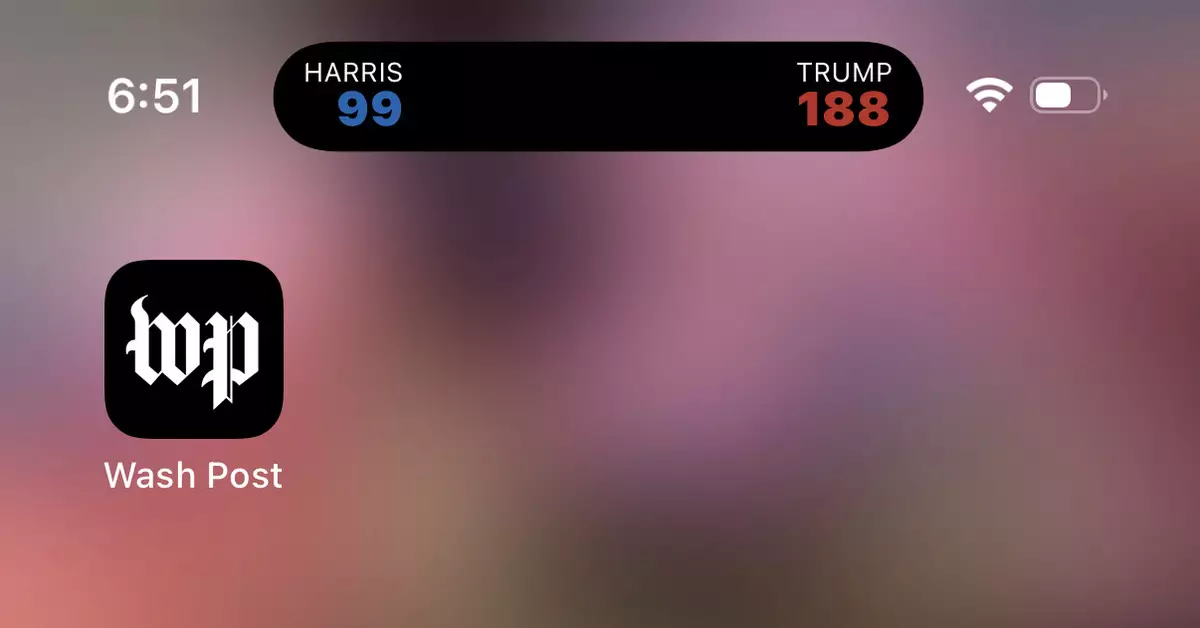
In an era where information is constantly at our fingertips, the integration of real-time updates into our devices has transformed the way we engage with significant events. Recently, iOS users experienced a peculiar yet compelling aspect of this phenomenon while using the Washington Post app. The introduction of a persistent black toggle displaying live electoral vote counts for the 2024 presidential race became a subject of frustration for many. Instead of enhancing user experience, this feature—often dubbed the “hell-toggle”—added an unintended layer of complexity to the already congested digital landscape.
Imagine checking your device to find an invulnerable notification blocking your view. This was the reality for many users as the toggle not only overshadowed their screen but also offered minimal actionable content in return. Instead of an avenue for instantaneous information, it became a nuisance—a testament to how even well-intentioned updates can misfire in the user experience department. The burst of excitement a user might feel seeing live political updates is quickly eclipsed by irritation when they realize that dismissal is not intuitive. The toggling between information and annoyance reveals a gap in user-centric design.
For those who found themselves at the mercy of this digital intruder, understanding how to navigate the iOS settings to remove it became essential. The steps, though seemingly straightforward, encapsulate a broader challenge with mobile applications: the quest for user autonomy amidst constant updates and changes. To dismiss the so-called “hell-toggle,” users were instructed to go to Settings, navigate to Apps, and adjust permissions concerning Live Activities. While these directions provided relief, they also serve as a reminder of the ongoing battle between innovative features and user satisfaction.
The controversy surrounding the Washington Post’s live update feature serves as a pivotal case study in app design and user interface considerations. It emphasizes the need for developers to balance the provision of real-time data with user control. Clever design should invite engagement without overwhelming the user. The existence of a similar toggle feature in Apple News highlights a systemic issue across app ecosystems where live updates can clutter the user experience.
Moreover, the incident raises questions about how media companies can better support users, especially in politically charged periods where information changes rapidly. Design strategies must consider not only the incentive to engage users but also the importance of allowing them to set their preferences without excessive difficulty.
As we continue to traverse the complexities of living in a hyper-connected world, the experience of managing notifications and updates will remain crucial in defining how we interact with technology. App developers must learn from such scenarios, ensuring that user interface changes complement rather than complicate the user experience. In doing so, they pave the way for a digital environment that respects user agency while keeping them informed and engaged in areas that matter most—like the upcoming 2024 presidential election.